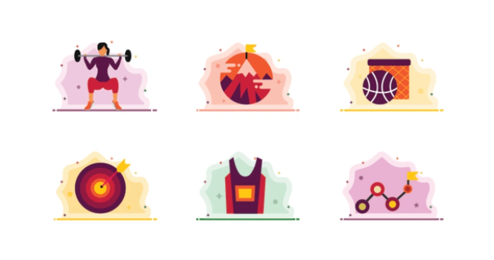
Creating custom icons for your website is a powerful way to enhance its aesthetics and functionality.
Icons are often the first visual elements users interact with when navigating a website.
By designing custom icons that align with your brand and user needs, you can improve user experience (UX), strengthen your website’s visual identity, and make your site stand out from the competition.
Custom icons can be used for various purposes—whether it’s for navigation, action buttons, or visual cues to help users understand your site better.
The process of designing them, however, goes beyond just creating pretty visuals. It involves careful planning, understanding your brand, choosing the right design tools, and implementing the icons in a way that enhances usability.
In this comprehensive guide, we will walk you through the entire process of designing custom icons, from conceptualization to implementation, with tips and tools that will help you succeed.
By the end of this article, you’ll have a solid understanding of how to create custom icons that are not only visually appealing but also functional and user-friendly.
Whether you are a beginner or an experienced designer, this guide will provide you with the knowledge you need to create standout icons for your website.
Why Custom Icons Matter for Your Website Design
Enhancing User Experience (UX) with Icons
Icons are more than just decorative elements; they play a pivotal role in user experience (UX).
When used correctly, icons can make navigation easier and more intuitive, providing users with a clear path to key actions or information.
For example, a magnifying glass icon next to a search bar instantly communicates the function of the element without the need for text.
This visual cue enhances UX by reducing the cognitive load on users, allowing them to navigate your site quickly and efficiently.
Moreover, custom icons can reflect the personality of your brand.
For example, playful and quirky icons may suit a fun, informal brand, while sleek and minimalist icons may align better with a modern, professional website.
Using custom-designed icons allows you to align the visual language of your site with your brand’s identity, further strengthening its distinctiveness.
Consistency in Design
Consistency in design is crucial for maintaining a cohesive aesthetic across your website.
Using custom icons ensures that all visual elements adhere to your brand’s style guide, providing a uniform look and feel.
By designing your own icons, you can ensure that the color palette, line thickness, shapes, and proportions all match your site’s design, whether it’s minimalist, contemporary, or detailed.
Consistency helps users intuitively understand the interface, making it easier for them to interact with the site.
Improved Website Performance
Another advantage of using custom icons is improved website performance.
Unlike generic stock icons or image-based graphics, custom icons are often vector-based (SVG), which means they are lightweight and scalable.
This ensures that they load quickly and look sharp on any screen, whether it’s a mobile device or a high-resolution desktop monitor.
Custom icons can help optimize your website’s loading time, contributing to a better overall user experience and improving SEO rankings.
Step-by-Step Guide to Designing Custom Icons

Step 1: Define the Purpose and Style of Your Icons
Before you dive into the design process, it’s important to first define the purpose and style of your icons.
Are they going to be used for navigation, buttons, or providing visual feedback for user actions? Understanding their function will inform their design.
Purpose of Icons
Icons can serve a variety of purposes, such as:
- Navigation: Icons like a hamburger menu, home button, or back arrow help guide users through your website.
- Actions: Common actions like liking, sharing, or adding items to a cart can be indicated with custom icons.
- Visual Cues: Use icons to alert users about new notifications, errors, or successes.
- Branding: Custom icons that reflect your brand’s unique style can help reinforce your identity.
Once you’ve outlined the function, the next step is to decide on the visual style.
Will your icons be flat, 3D, outline, filled, or something else? The style should align with your website’s overall aesthetic.
Icon Style
Your icon design style should be consistent with your site’s branding.
For example:
- Minimalist: If your website has a clean, modern design, go for simple, flat icons with clear outlines and minimal details.
- Illustrative: If your site has a more playful or creative tone, you can use more detailed, colorful, or hand-drawn-style icons.
- Flat or Material Design: These are popular choices for modern websites, as they focus on simplicity, bright colors, and user-centric design.
Step 2: Research and Gather Inspiration
Before you start designing, research other icon sets and websites to gather inspiration.
While you want your icons to be unique, looking at what others are doing can provide valuable insight into trends and best practices.
Check out popular icon libraries like:
- Noun Project
- Iconmonstr
- Font Awesome
- Material Icons
Look at your competitors or websites you admire and take note of the types of icons they use, their visual consistency, and how effective they are in communicating actions or messages.
Step 3: Choose the Right Design Tool
There are several tools available to help you design custom icons, and choosing the right one depends on your experience level and needs.
The most common design tools for creating custom icons include:
- Adobe Illustrator: The industry-standard vector design tool. Illustrator is powerful and versatile but may have a steep learning curve for beginners.
- Sketch: A vector-based design tool that’s great for web and UI design. Sketch is widely used for designing website components, including icons.
- Figma: A cloud-based design tool that allows for real-time collaboration. Figma is perfect for web design and has become a popular choice for icon creation due to its ease of use.
- Inkscape: A free, open-source vector graphics editor. It’s a good alternative to Illustrator, especially for those on a budget.
If you’re not familiar with these design tools, consider using web-based alternatives like Canva or Iconscout, which offer templates and easy-to-use interfaces for icon creation.
Step 4: Design Your Icons Using a Grid System
When designing your icons, it’s essential to start with a grid system. Icons are typically designed using a 24×24 or 48×48 pixel grid.
This grid ensures that all icons have consistent proportions, which is important for usability and aesthetics.
Adhering to a grid also helps maintain balance, alignment, and clarity across different icons.
Using a grid will ensure your icons are clean and well-proportioned, making them legible at different sizes.
You can also experiment with negative space (the empty space within and around your icons) to make sure your designs are visually appealing and easy to comprehend.
Step 5: Focus on Simplicity and Clarity
One of the most important principles in icon design is simplicity. Users should be able to instantly recognize the meaning of the icon without needing a description.
Overly detailed icons can become confusing and hard to decipher at smaller sizes, so it’s essential to focus on clarity.
For example:
- Use basic geometric shapes, like circles, squares, or triangles, to form your icons.
- Avoid adding excessive text or tiny details that won’t be visible when the icons are reduced in size.
- Stick to a minimal color palette that aligns with your website’s design scheme. Using too many colors can make icons look cluttered and unprofessional.
Step 6: Ensure Consistency Across Your Icons
Consistency is crucial when creating a custom icon set.
Every icon you design should feel like part of the same visual family. This consistency helps users recognize and understand the icons more easily.
Here are some key aspects to keep consistent:
- Line thickness: Ensure that all icons have the same line weight to create a unified look.
- Corner radius: If your icons have rounded corners, make sure the radius is consistent across all icons.
- Color palette: Use the same primary color palette across your icons to maintain cohesion.
Consistency will also make your site look polished and professional, reinforcing your brand’s visual identity.
Step 7: Test Icons at Different Sizes
Once you’ve created your icons, it’s essential to test them at different sizes.
Icons are often used in various contexts, such as in navigation menus, action buttons, or favicons. Therefore, they must remain legible and recognizable, no matter the size.
Optimizing Icons for Small Screens
Small icons, such as those used for mobile navigation or buttons, need to be particularly clear and simple.
When testing icons at smaller sizes, ensure that the design remains legible. Avoid intricate details that may get lost when scaled down.
Testing for Retina Displays
Icons should also be optimized for high-resolution displays (e.g., Retina displays).
These screens can display images with much more clarity, so your icons should look sharp and detailed even when viewed on larger, higher-resolution screens.
Step 8: Export Icons in Multiple Formats
Once you’re satisfied with the designs, it’s time to export your icons.
Here are some common formats you’ll need:
- SVG: The most popular format for web icons. SVG files are scalable and lightweight, making them perfect for responsive design.
- PNG: If you need raster-based icons, PNG files are a great option. They are best used for fixed-size icons.
- ICO: Use this format for your website’s favicon, as it supports different resolutions and is compatible with most browsers.
- Webfont (e.g., Font Awesome): If you’re using icon sets, you can create a webfont that allows you to display icons as fonts in your HTML code.
Make sure to export icons at different sizes (16x16px, 32x32px, 64x64px, etc.) to ensure they look great across all screen sizes.
Step 9: Implement Icons on Your Website
Once your icons are ready, it’s time to implement them into your website.
There are two common ways to do this:
- Using SVGs: If you exported your icons as SVGs, you can embed them directly into your HTML code for better scalability and faster loading times.
- Using Icon Fonts: If you used a webfont for your icons, you can easily add them to your site by referencing the appropriate CSS class in your HTML.
Make sure the icons are placed in strategic areas, such as navigation menus, action buttons, or for visual feedback, to enhance user experience.
Step 10: Test for Usability and Collect Feedback
Finally, once your icons are live, gather feedback from real users.
Are the icons intuitive?
Do they perform their intended function?
Testing and gathering feedback will help you identify any areas of improvement and make adjustments.
EXPLORE MORE AT: ShockIcon
Conclusion
Designing custom icons for your website is a rewarding process that can significantly improve user experience and strengthen your brand identity.
By following these steps, you can create icons that are not only visually appealing but also functional and easy to understand.
By defining your icon’s purpose, maintaining consistency, testing usability, and choosing the right design tools, you’ll be on your way to creating an impactful and user-friendly website.
Remember to keep things simple, prioritize clarity, and align your icons with your overall design aesthetic.
Happy designing!


